
Do you sell products online?
With e-commerce sales predicted to hit $4.5 trillion by 2021, there is a growing market for your business.
But if you don’t ensure your e-commerce store is mobile friendly, you’ll lose traffic, clicks and conversions.
When you develop an ecommerce store, you should always be on the lookout for tools and techniques that can bring you more traffic and more sales.
From optimising your product descriptions to updating your design and everything in between, Shopify website development can help enhance your store's performance and user experience.
The truth is, great products don’t sell themselves. That’s true whether you use Shopify, Big Commerce, Magento or another platform entirely.
You have to work hard to set up your store and cultivate a reputation as a trustworthy authority in your niche. Then you have to fight to stay relevant. Keeping your traffic and conversion numbers up where you want them is a challenge.
You have plenty of variables to consider and, ideally, to perfect. You need to:
- market to the right audience
- maintain a positive social media presence
- keep your website running fast and smooth
- keep your product portfolio attractive to customers
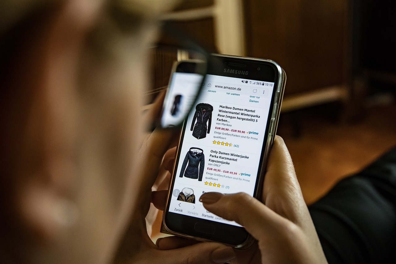
Here’s a new area to focus your attention too – You need to make sure your store is welcoming to the ever-growing number of customers who will reach it through mobile devices.
Given that this is one of the most important Google ranking factors, it will help tremendously up your SEO rankings.
The latest numbers show that mobile e-commerce sales, worldwide, now account for a majority of all e-commerce sales: 63.5%. By 2021, that figure could go as high as 72.9%.
And with mobile devices accounting for 53% of all paid search clicks, you need to be mobile friendly. It’s that simple.
Ready to finetune your ecommerce store and get the mobile traffic, clicks and conversions you deserve?
Here’s how.
1) Minimise Distractions
Each of your mobile customers should have a well-defined path laid out in front of them when they reach your e-commerce store.
Mobile selling is a fast game (the average transaction takes just four minutes), and you need to stay focused.
You don’t need muddled priorities or premature upselling. Upselling, in particular, is deadly for mobile e-commerce. Forcing a new product or bundle on people can generate friction that destroys a potential sale.
It is relatively common to attempt to add more products and services to a customer’s order before they complete their transaction, but in the mobile arena, this is better done after the initial purchase.
There are two reasons for this.
One – Trying to upsell your customer puts additional steps in her path, increasing the risk of second thoughts and opting out.
Two – Your customer will be more receptive to additional sales after she has already made a purchase and developed a sense of commitment.
Search It Local marketing expert Clarinda Cheon explains that minimising distractions can also help your SEO. She notes “improving your UX does more than raise conversions on a micro scale. The macro benefit comes in the form of better SEO as people spend longer on your site, browse more pages, and click on more products. All marketing is linked in some way, so focus on these small changes as they have great consequences.”
2) Optimise Your Photos
The importance of professional imagery on your e-commerce store is key.
No matter what you’re selling, it needs the most compelling photos you can find. Let your images be the hero – powerful, compelling, captivating.
Shopify itself is clear on the value of imagery, telling sellers that quality product images will drive engagement, conversion, retention, and lifetime value.
Photos are essential tools for connecting your customers to your products. This is key, according to e-commerce entrepreneurs Tow and Line. They explain “you can’t make use of physical contact in e-commerce; no one can try on your products, so your images have to do as much as they can to bridge that gap. Make people feel what it would be like to be the model in the image, or show them how your product can make their life better. These small tweaks go a long way towards more conversions.”
3) Utilise Smart Search
Running a search on a mobile device can be a tedious process on a site that’s not built for it.
Think of how frustrated your audience will be trying to zoom in, type on your screen, or click search buttons. These are all potential points of friction and frustration.
Incorporating smart search is a terrific way to ease that friction, improve the shopping experience for mobile users, and make more sales.
What is smart search?
When inputting just a few letters in the search bar, smart search will bring up a range of logical and popular options to pick from. This can help reduce the actions needed from your site visitors, and that’s going to help increase conversions.
4) Build A Better Shopping Cart
Your shopping cart page can be optimised to be more welcoming to mobile customers.
Following a few commonsense design principles here can significantly improve your customers’ experience.
- Notify your users when they add an item to their cart. You don’t need to add a stumbling block by demanding clarification, just make sure they know what they’ve done.
- Next, make the cart icon itself display the number of items in the customer’s cart at all times.
- Ensure you have all of the essential details of the products in the shopping cart on a summary page. This frees customers from the need of clicking through another link to confirm details.
- If you use discount codes or coupons, make sure they are as easy as possible to input.
- Finally, make sure your payment and shipping options are easy to understand and edit on a mobile screen.
5) Design For The Thumb
Mobile-friendly design includes what is known as the ‘larger thumb’ principle.
Try not to use tiny links in your store. Mobile users will find them frustrating, and they can lead to navigation errors that can spoil sales. When in doubt, pick up your own phone. The area you can comfortably reach with your thumb should contain your core elements, buttons and links.
Whenever you are uncertain about the size of website and design elements in your store, err on the side of size.
Converting every clickable element into a wide button ensures mobile users will hit the link they mean to.
6) Obey The ‘Three-Tap’ Rule
Simplicity is the core principle of mobile e-commerce.
Keeping transactions simple is how you get more sales from your mobile customers.
The ‘three-tap’ rule is simple. Once a mobile customer has reached your store, it should take no more than three taps to reach a purchasable product. A basic customer journey might look like this:
Tap #1 – From your store homepage, the user selects a product category
Tap #2 – Within the category, the user selects a manufacturer
Tap #3 – The user picks a specific product from the manufacturer’s list
From there, the customer should be able to immediately start the check-out process.
As easy as 1, 2, 3.
Looking for more ecommerce support?
- Explore the Pros and Cons of Shopify
- Ask these 9 questions before spending a CENT on web design
Look for more articles here:
- Top eCommerce Web Design Companies
- Top BigCommerce Developers
- Top Small Business eCommerce Companies
- eCommerce Development Company
- Best Shopify Developers
- Top Magento Developers
- WordPress Website Development Companies